This post is also available in English
Hello and welcome to my blog! I’m thrilled to have you joining me today as we celebrate the release of a stunning “Just Add Color” rubber stamp collection from Stephanie Low & Spellbinders. More about the blog hop & giveaway below, but first, let’s talk about these stamps and things you can make with them.
Like this project? Pin it and save for later | Curious about my project photography? Click for details.
The “Just Add Color” collection is just that – it is full of beautiful hand drawn outline florals we see all around us. There are 10 red rubber stamp sets in this line, each it’s own flower or a grouping of flowers as well as some mandalas, too. These can be used separately or combined together with a little bit of masking to create stunning floral arrangements (there’s tons of inspiration on the Spellbinders blog using these, too; be sure to take a look). There are no coordinating dies available for these stamps, so if you want to cut them out you’ll have to fussy with scissors.
VIDEO TUTORIAL
As always, I filmed a video tutorial showing how to create this project from start to finish. I’m hoping you’ll enjoy it. Watch it below or on my Youtube channel:
Like my video? Please give it a “thumbs up” (you can do this on Youtube video page right under the video) and share with a crafty friend! Leave me a comment too, I love hearing from you!
CARD DETAILS
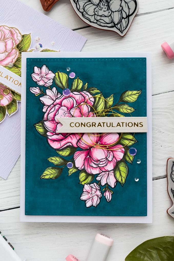
I started making my card by creating masks for the images I was planning to use. I stamped flowers onto masking paper and cut them out with the help of detail scissors. Next, using a mini MISTI stamping tool, I create a large floral arrangement by stamping images, masking them and adding additional images in the background.
Images were stamped using Spellbinders Cave Black ink by Jane Davenport, this is an alcohol marker friendly ink, similar to Intense Black by Simon Says Stamp and Hero Arts, it works beautifully with alcohol markers or watercolor mediums and doesn’t bleed from either.
Once my stamping was done I started coloring. I used Copic markers for this project today as I often consider them a speedy way to color. I’ve said this a million times – I’m not whiz when it comes to Copic markers or any coloring medium for that matter and I just do basic coloring without giving it much thought.
I typically have the base of the leaves or petals darkest as this is where you’d normally see most of shadows in nature and keep the tip or the center of the leaf or petal lightest and use my medium marker color to transition between the two. If I feel I need to I often go back to the darkest areas and intensify them even more to have darker, deeper shadows on my projects to set the mood.
I used the following marker colors for both of the cards I’m sharing today:
- G99 dark, G94 medium, YG03 light.
- RV23 dark, RV10 medium, RV00 light.
- RV14 dark, RV13 medium, RV10 light.
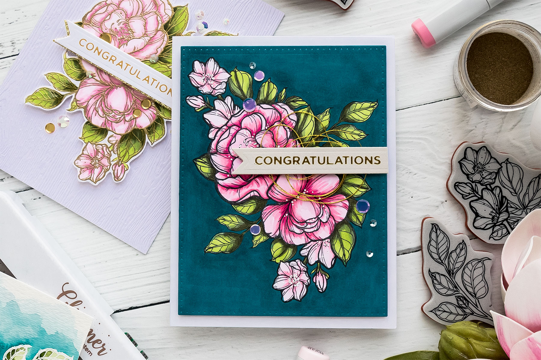
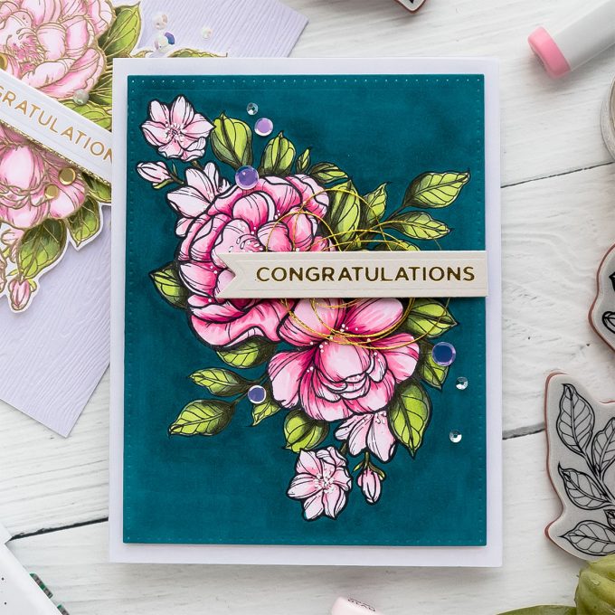
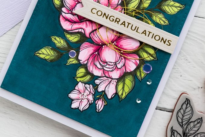
To create a dramatic effect on this card I also colored a background. For this I employed a BG09 marker. It’s a new one in my collection and I picked it up specifically with background coloring in mind. I love to create bold, dramatic cards and using a dark background is one way to do it. I also love to have bright vibrant colors on my projects and if I start with a dark background I’m not always able to achieve that, at least not with every kind of coloring medium I like to use. If I color with Copic markers I opt for a white or light background and simply color it in using my preferred color.
Coloring a background on a card takes some time and it also takes a lot of layers, especially with Copic markers. The key here is to take it slow and one layer at a time, I think, and to keep coming back to the background to add more saturation and more ink to get desired effect. This will use a lot of the ink from your marker, so be ready. Copic markers are expensive, you might not want to use up your marker ink to color a background. Perhaps use a cheaper medium in that case.
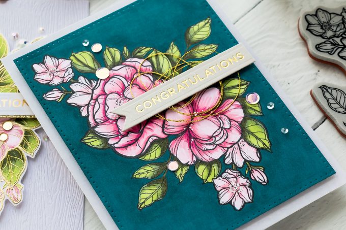
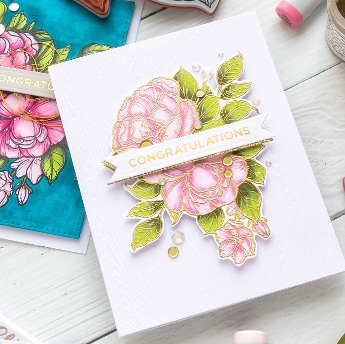
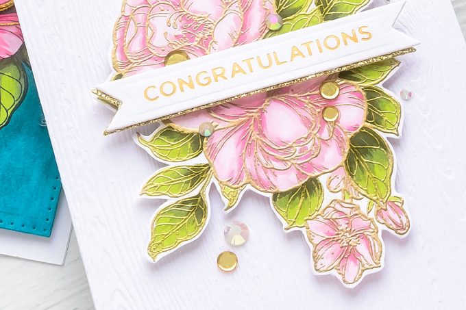
Once my coloring was finished I stared working on a sentiment for this card. I decided I’d foil one using Spellbinders Glimmer Hot Foil System and Glimmer plates. After foiling my sentiment in matte gold foil I cut it out using a banner die from the February Glimmer Kit and added on to the card.
To finish this project I die-cut my colored panel using pierced rectangle die and foam mounted it onto an A2 white card base. I also added some gold thread and embellished this project with a few sequins from my stash.
I made another card using same supplies and almost identical floral arrangement. This time I went with a white background with woodgrain texture. You can see how big of a difference a dark background can make. I love both looks, but sometimes prefer the dark one. Which one do you like more? Let me know in the comments below.
BLOG HOP
Spellbinders
Stephanie Low
Yana Smakula – you are here!
Mona Tóth
Lea Lawson
May Sukyong Park
Janette Kausen
Therese Calvird
Justine Hovey
Virginia Lu
Jacquie Dean
Kelly Latevola
Emily Midgett
Yoonsun Hur
GIVEAWAY!
To celebrate this release, Spellbinders is giving away a $50 gift certificate to 3 lucky blog readers – selected from the comments across all of the blogs in the hop. Giveaway closes on Sunday, February 24th 11:59 pm EDT. Winners will be announced on Spellbinders blog in the blog hop post the following Monday. Winner is responsible for shipping cost, duties and taxes.
SUPPLIES
I’m listing the products I used below. Click on the link to go directly to the product. Where available I use compensated affiliate links which means if you make a purchase I receive a small commission at no extra cost to you. Thank you so much for your support!
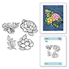 Spellbinders Large Peonies Cling Rubber Stamps Shop at: SSS | SC | SB |
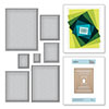 Spellbinders Scored and Pierced Rectangles Shop at: SC | SB | AZ |
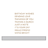 Spellbinders Everyday Sentiments II Glimmer Hot Foil Plate Shop at: SSS | SC | SB |
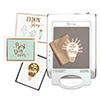 Spellbinders Glimmer Hot Foil System Shop at: SSS | SC | SB | AZ |
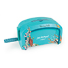 Spellbinders Deep Sea Die Cutting and Embossing Machine Shop at: SSS | SC | SB | AZ |
 Glimmer Hot Foil Kit of the Month Club Shop at: SB |
 Glimmer Hot Foil – Matte Gold Shop at: SC | SB | AZ |
 Jane Davenport Squid Ink Cave Black Shop at: SSS | SB | AZ |
 Simon Says Stamp Fog Gray Cardstock Shop at: SSS |
 Neenah 110 Lb Solar White Cardstock Shop at: SSS | AZ |
 Hero Arts Decorative Woodgrain Cardstock Shop at: SSS | SC | HA |
 Simon Says Stamp Masking Paper Shop at: SSS |
 Judikins Eclipse Art Masking Tape Shop at: SSS | AZ |
 Mini Misti Stamping Tool Shop at: SSS | SC | HA | AZ |
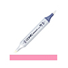 Copic Sketch Marker RV14 Begonia Pink Shop at: SSS | AZ |
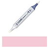 Copic Sketch Marker RV13 Tender Pink Shop at: SSS | AZ |
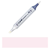 Copic Sketch Marker RV10 Pale Pink Shop at: SSS | AZ |
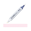 Copic Sketch Marker RV00 Water Lily Shop at: SSS | AZ |
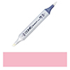 Copic Sketch Marker RV23 Pure Pink Shop at: SSS | AZ |
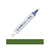 Copic Sketch Marker YG99 Marine Green Shop at: SSS | AZ |
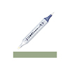 Copic Sketch Marker G94 Grayish Olive Shop at: SSS | AZ |
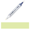 Copic Sketch Marker YG03 Yellow Green Shop at: SSS | AZ |
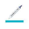 Copic Sketch Marker BG09 Blue Green Shop at: SSS | AZ |
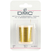 DMC Metallic Gold Embroidery Thread Shop at: SSS | AZ |
 Simon Says Stamp Sequins Girl’s Best Friend Shop at: SSS |
 Pretty Pink Posh Metallic Gold Confetti Shop at: SSS | PPP |
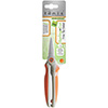 Tonic Spring-cut Fine Tip Detail Scissors Shop at: SSS | AZ | TS |
 Tonic Deluxe Adhesive Nuvo Glue Shop at: SSS | SC | AZ | TS |
 Crystal Ninja Crystal Katana Pick Up Tool Shop at: SSS | AZ |
SAVE ME/PIN ME TO PINTEREST
Like this card idea? Be sure to save it to one of your Pinterest boards for future reference!


both cards are gorgeous, Yana but my favorite is the second on – probably because i like the softer colors.
OMG these are just beautiful and your coloring is amazing! Thanks for sharing such beautiful designs created with these new ‘fun to color’ images! Great job!
Nice cards. Really like the gold with the pink.
Beautiful cards and thanks for the video.
Nerdy pretty!
What beautiful cards. Love the variety of color.
Oh Yana, these cards are so beautiful. I love the coloring techniques, I have a very few copics and only use them occasionally as I am not very proficient with them. Your designs are so gorgeous and love the layouts and coloring techniques.
Just so very beautiful. Love both the cards … thanks for sharing 🙂
Absolutely gorgeous cards! Your coloring is just so beautiful for each one of the cards! And I really enjoyed watching your video too!
Tough decision but I think I’ll choose the white background. That just looks so pretty on the textured background with the gold embossing.
Both cards are stunning. Thanks for sharing.
stunning! luv how you showed this floral image can be as bold as you want, or classy on a simpler card!
The video is very helpful. I love both of your cards, they are stunning!
Really love the first card
Wonderfully colorful cards!
Just beautiful! Love the way you made your arrangement, then colored it. What an awesome hop!
I like the darker background better, but both are lovely.
Love the colours and cards. Thanks for sharing your project.
Just stunning colors and coloring! I love your designs and the gold embossed one!
Gorgeous creations! I especially love the bold background colored card!!
Oh!! These are just stunning!!! Such gorgeous stamps and your coloring is amazing!!
I love how you give the marker numbers you use that I could practice!
Gorgeous cards, Yana! I love the dark blue background and the pink flower. So stunning!
Absolutely stunning cards! Such beautiful designs, color combinations and coloring. Gorgeous!
Absolutely gorgeous! I wish I could control the markers like you do.
Both card versions are so beautiful but the first one on deep blue is really dramatic!
Gorgeous cards! Thanks so much for sharing your video!
Just too gorgeous. Love your color choice!!!
So lovely and a
interesting look
with the dark
background.
Carla from Utah
Wow these cards are beyond stunning, I subscribe to your blog so as never to miss a thing and am always awed by your beautiful designs!!
As always, your coloring is wonderful! Love how you broght the new florals to life with copics.
Beautiful cards. Love the colors on both.
Both of these cards are stunning but I really do like the blue background! It just makes the pink colors stand out so much. Thanks for the video.
I can’t pick a favorite, they are both beautiful!
Your cards are beautiful. It’s hard to pick which one I like better. I think I’m leaning to the darker one.
The pinks on the flowers are so vibrant. Simply brilliant cards.
Beautiful cards? I do like the white background better though.
Gorgeous cards as always.
Beautiful cards, as usual! (; One of my favorite color combinations is navy, pink and white, so I just love that card! However, the second one is so lovely with the gold embossing and pink hues that I honestly can’t choose which is my favorite! A happy dilemma! Thanks for your inspiration!
What fabulous flowers!
beautiful coloring of the floral images!
Great cards!
Great cards!!!
Awesome cards and great video tutorial Yana, thank you so much for showing the gorgeous stamps designed by Stephanie.
The flowers pop off the dark blue background.
Your coloring is fantastic. thanks for sharing
txmlhl(at)yahoo(dot)com
Gorgeous coloring on these beautiful designs!
Both cards are gorgeous but for a favorite I would pick the dark background, only because it’s more vibrant. This Just Add Color collection by Stephanie Low is ah-mazing, I love it all! Thank you for sharing both versions of your card and for the always awesome inspiration. (mardy14@bellsouth.net)
Beautiful cards, Thanks for the chance to win and sharing.
I like them both, but the BG09 is dramatic for these fabulous florals, indeed! I just recently did my first decent background in Copics… it took a while to master, so I admire the time you took on this! Love the suede look it seems to have in the pic, too!
Gorgeous cards!! I love the bold background of the first card and I love the soft colors of the second card.