This post is also available in English
Hello, friends! Summer is in full swing here in Phoenix and oh my, it is hot! I am so grateful there is a pool at the apartment complex where we live – makes it easier to take all of the heat, plus I love to swim so it’s a win win.
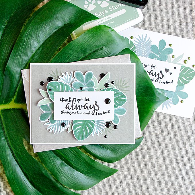
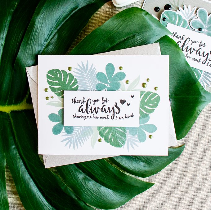
Today I’d like to share a card inspired by Summer and all things tropical. I have two takes on one design – a simpler almost one layer card (at the bottom of this post) and one that involves a lot of die cutting. I made the simpler card first, but didn’t like it the next morning so decided to step up the design and add die-cutting. Now I am not so sure which one I like better, I’m curious to hear what you think.
Like this project? Pin it and save for later | Curious about my project photography? Click for details.
CARD DETAILS
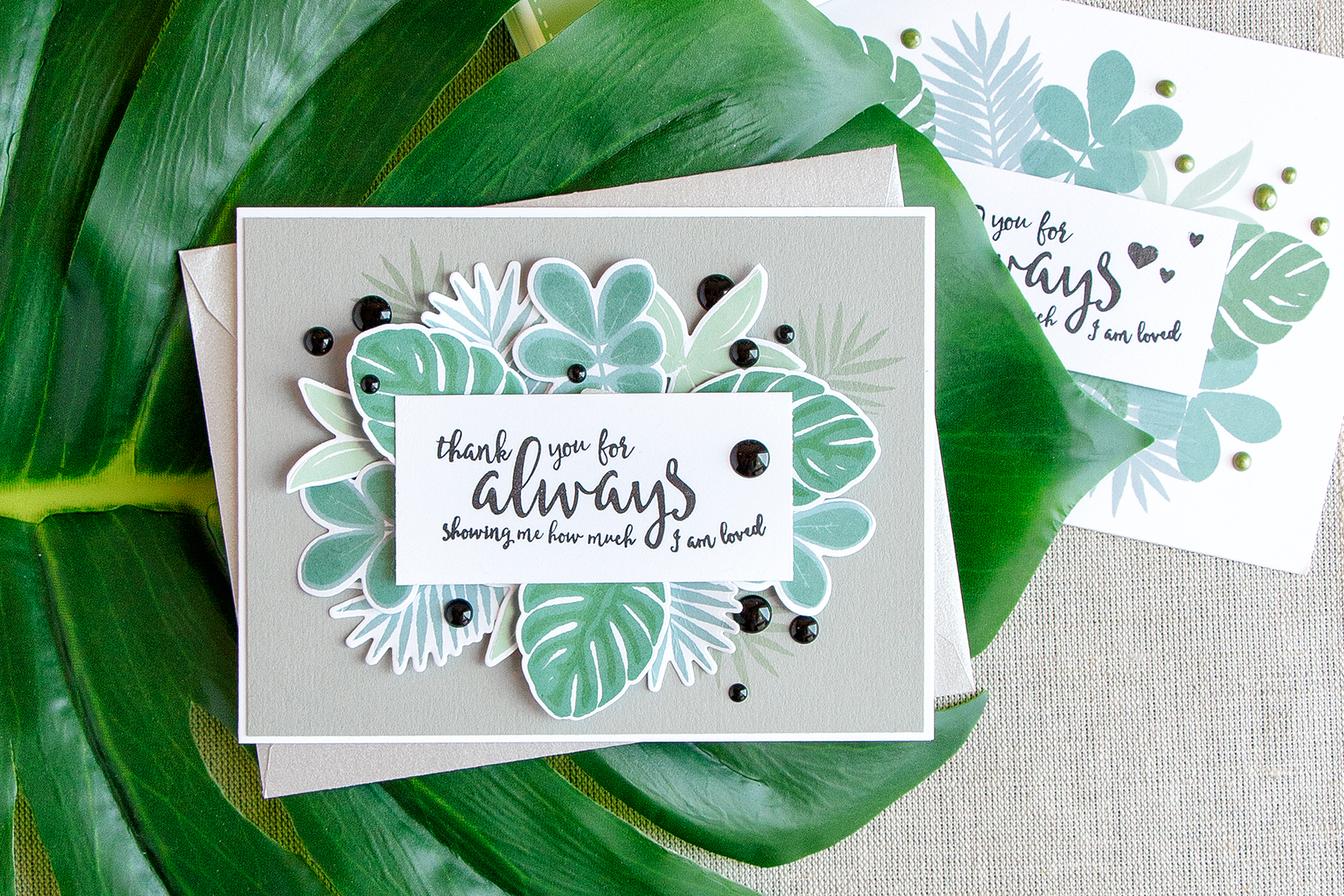
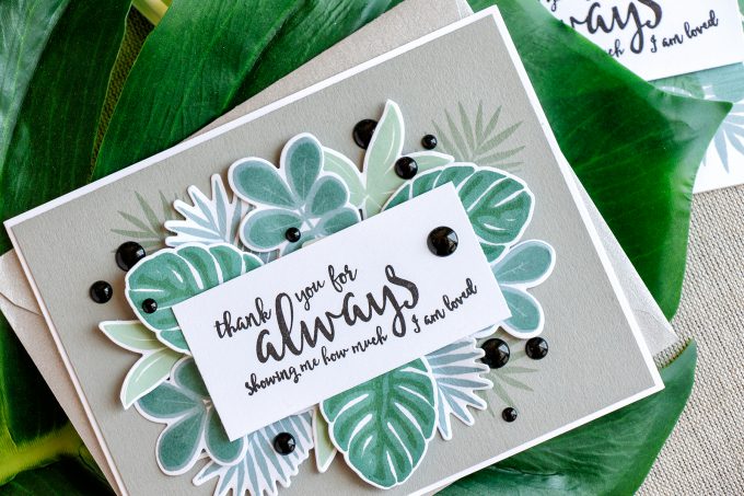
I picked one of my favorite Summer stamp sets from Simon – Tropical Leaves and decided to stamp leaves so they would frame the sentiment in the center of my card. I picked a beautiful handwritten-like message from the Loving Heart set and stamped it in black ink onto a piece white cardstock. I trimmed it and marked its size on my background panel – this helped me determine how much I needed/wanted the leaves to peek out from behind it.
To stamp the leaves I used several colors of green ink, I don’t think I’ve used them much in the past and it was a mistake on my part – those are fabulous colors. I am a fan of vibrant and bold colors, but those are just as pretty. So the colors I used are (from light to dark): Dusty Sage, Seafoam, Lauren Green, Evergreen. The only other color used for these cards was black.
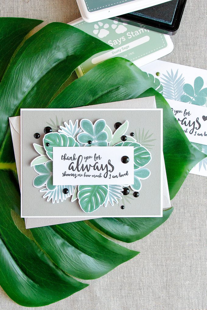
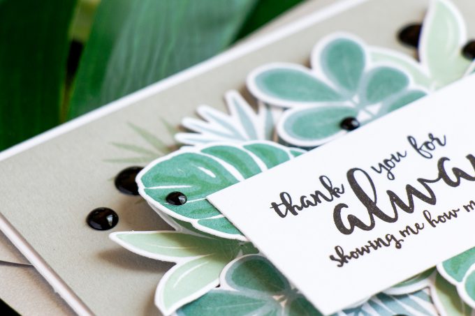
I stamped and die-cut 4 different leaves, 3 of each so I ended up having 12. I also added additional stamping directly onto the background panel (made out of Simon’s Smoke cardstock and cut to 4 x 5 1/4″). After shaping each leaf with my fingers I adhered most of them using glue and only a few were popped up using regular and thin foam adhesive squares.
Next I foam mounted the sentiment panel and added black enamel dots from my stash to finish this project.
Here’s a look at the variation of this design, this one does not involve any die cutting, just simple stamping. Notice I didn’t add second detailed layers onto the leaves and only stamped them using single ink color for a simpler, bolder look. I also added green dots using Nuvo Drops in Bottle Green.
Which one do you think turned out better? The stamped and die-cut or the stamped one? Leave me a comment below. Thanks!
SUPPLIES
I’m listing the products I used below. Click on the link to go directly to the product. Where available I use compensated affiliate links which means if you make a purchase I receive a small commission at no extra cost to you. Thank you so much for your support!
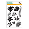 Simon Says Clear Stamps Tropical Leaves Shop at: SSS |
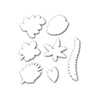 Simon Says Stamp Tropical Leaves Wafer Dies Shop at: SSS |
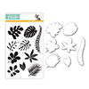 Simon Says Stamps and Dies Tropical Leaves Shop at: SSS |
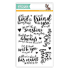 Simon Says Clear Stamps Loving Heart Shop at: SSS |
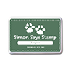 Simon Says Stamp Evergreen Dye Ink Pad Shop at: SSS |
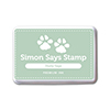 Simon Says Stamp Dusty Sage Dye Ink Pad Shop at: SSS |
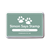 Simon Says Stamp Laurel Green Dye Ink Pad Shop at: SSS |
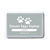 Simon Says Stamp Seafoam Dye Ink Pad Shop at: SSS |
 Simon Says Stamp Intense Black Ink Shop at: SSS |
 Spellbinders Platinum 6 Die Cutting Machine Shop at: SSS |
 Neenah 80LB Solar White Cardstock Shop at: SSS |
 Neenah 110 Lb Solar White Cardstock Shop at: SSS |
 Simon Says Stamp Smoke Cardstock Shop at: SSS |
 Scrapbook Adhesives Thin White Foam Squares Shop at: SSS |
 Doodlebug Beetle Black Sprinkles Assortment Shop at: SSS |
 Scrapbook Adhesives White Foam Squares Shop at: SSS |
 Tonic Bottle Green Nuvo Crystal Drops Shop at: SSS |


Beautiful cards Yana, I love the clusters of leaves. Funnily enough, I was just thinking of using tropical leaves myself this weekend (must have been getting subliminal messages – lol)! Thank you Yana,have lovely weekend 🙂
I like them both; however, I would have to say I really like the one with the die cuts. Something about it and I can’t put my finger on it … maybe the dimension/layers?? And all so pretty against the smoke colored cardstock. Great color combo. I also really like the sentiment. Thanks for sharing!
I’m wondering … what a card like that would look like if I took all the die cuts, cut a rectangle through them all (to create a window), placed the stamped sentiment at the back of the card (with die cuts layered on top of it and a frame around the window). Hmmmm! Hot here in Tucson as well but we’re always just a bit cooler than Phoenix. Stay cool and enjoy the pool !
I usually like layers better but I prefer the flat one in this case. It might be the white outline left by the dies. It’s very distracting on something so organic as the tropical leaves. Gorgeous design Yana!
Lovely. You make such beautiful cards, and take such great pictures of them.
Hi Yana ~ Both of these cards are stunning but I have to admit I like the one that offers more dimension better; everything seems to just pop. They’re both lovely and the second one would be better to send off in the mail to someone. As always, your cards and photography are stunning. Have a wonderful weekend! ~HUGS~
#kindnessmatters
This is an amazing color combination! I love the subtle shades and layering. The die cut one speaks to me the most. Thank you for the great inspiration!
The colours are wonderful on both cards. I think I prefer the die-cut one due to the dimension, but I thank you for showing the one that is just stamped which is lovely too. The reason? I have next to no dies due to the expense of them, so seeing you one layer card as well helps me know that a beautiful card can be created without dies.
Two beautiful summery cards! My favorite is the one with the dimensional die cuts. You are right, those ink colors are definitely under-appreciated.
Beautiful cards!! Both of them!! I think I like the added dimension of the die cut one just a little more. Great colour combination too. Another amazing work of art from you. Thanks for sharing your creativity with us once again!!
Delightful cards, Yana! Love them both, but I can’t help to be drawn to the dimensional one. I just love the layers.
Love both cards! Sometimes though time is a factor and I go with a simpler card with less layers. You couldn’t go wrong with either card to mail out! Love your colors also.
Wow! It’s hard to chose a card when I really like them both for their unique take. I’m partial to creating layers–gives a card that something extra–but there’s something about the second card that’s very attractive. I think it’s the white background. It really showcases the greens. Thanks for sharing both.
I loved the layering and placement in the second card. Appreciate the beautiful work you put into both cards!
I appreciate both types of cards, almost single layer and layered. Both are gorgeous!
Ooooh, I love how you popped up some of the foliage. Beautiful job Yana!
Gorgeous card!!
Both cards are beautiful and so tropical!
I cannot say which I like more. Having similar design they do look and feel differently.
Here in NYC Sumer is hot and humid and unbearable ;( Waiting for fall 😉
Hi Yana! The card with the die cuts is my favorite although they are both amazing!
These are both great but I think I prefer the stamped one, probably for the mailing reason. Just flatter for the mail.
I LOVE this card! I will have to case it! Thanks for sharing.
This would be a wonderful set of cards to gift! I like both but prefer the stamped version.
Love both of these designs! Simple one is great for a last minute card.
The die cuts always stand out…pun. The stamped card is lovely too. I like both and see the extra effort that went into the die cut version. Love the mono-chromatic style too.