This post is also available in English
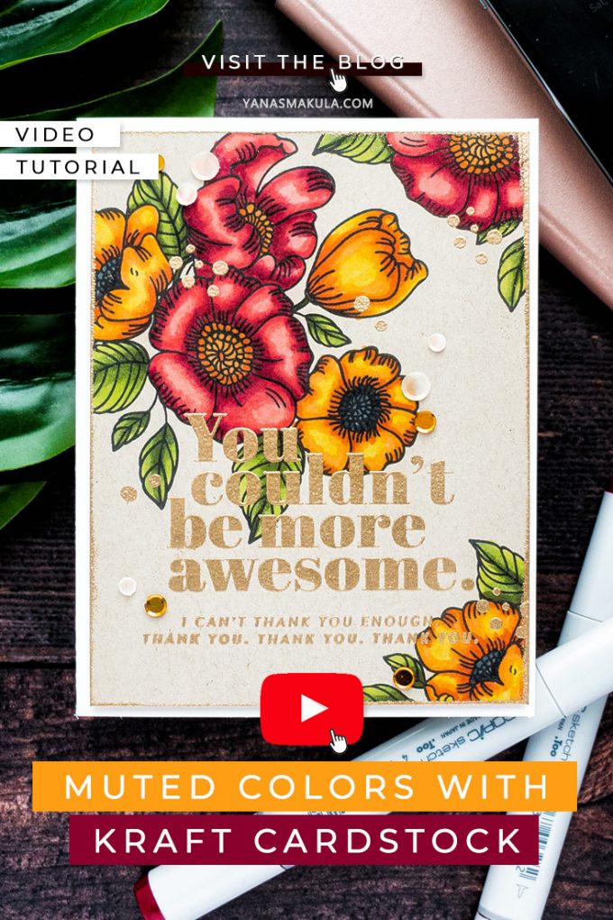
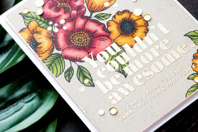
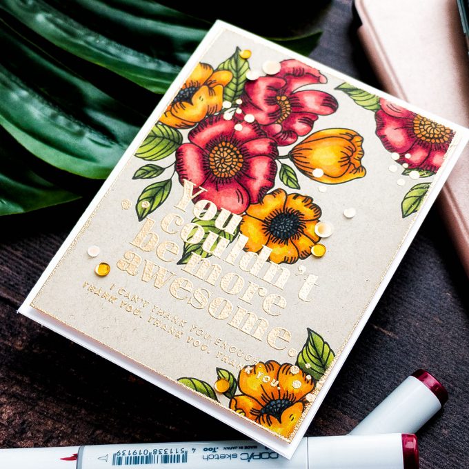
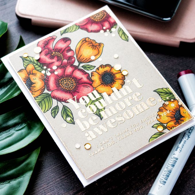
Hello and welcome back for another Yippee For Yana video! In this episode, I will show you how to use kraft cardstock to your advantage when coloring with Copic markers and creating a Fall card in muted colors.
When I was finishing this card my husband stopped by my desk and expressed his astonishment regarding the fact that Copic markers color so well on kraft cardstock. He said, and I quote – I thought they only worked on white.
And I think a lot of people have this perception, we believe that Copics are a good coloring medium to use on white paper only. I am the kind of person who likes to break the rules and even rebel if you will, so when it comes to this coloring medium I’m all about trying something else besides the ordinary.
Like this project? Pin it and save for later | Curious about my project photography? Click for details.
VIDEO TUTORIAL
Watch the video below or on my Youtube channel.
Like this video? Please give it a big thumbs up (you can do this on Youtube video page right under the video) and share with a crafty friend! Leave me a comment too, I love hearing from you!
CARD DETAILS
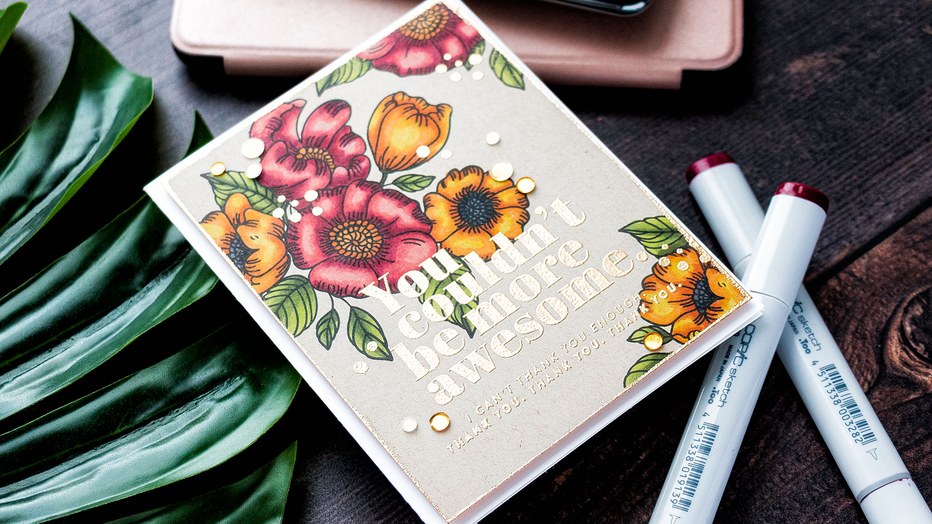
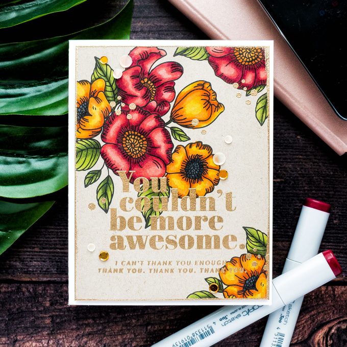
I started to work on my card by stamping a beautiful floral cluster from the Thankful Flowers stamp set from the October 2019 Card Kit from Simon in Intense Black ink onto kraft paper that was included in my kit. I cut the panel down to 4 1/4 x 5 1/2” and I’ll later trim it down some more.
I wanted to have more than just that one cluster on the card, so I used other, single floral and leaf images from my stamp set to add additional imagery to this panel. I did a little bit of simple masking – I stamped the two single flowers onto masking paper, cut them out making partial masks, and added single stamped leaves next to them creating two mini clusters in the bottom right and top right corners on the panel forming a floral cluster triangle of sorts. The middle bottom area of the panel is where I planned to have the sentiment, so I kept it relatively free from imagery.
With the stamping done I moved to the coloring part. I am not a pro when it comes to Copic markers, I don’t have a whole collection, in fact I only have a handful of markers, but over the years I have collected the colors that work really well together and whenever I color with Copics I tend to stick to the same colors over and over again and you’d be surprised, the only thing that changes is the color of the paper that I color on. Truth be told I find myself rarely coloring on white these days.
The colors I picked for my coloring are G99, G94 and YG03 to color the leaves. This green combo looks great on kraft and becomes more muted and a lot more suitable for Fall coloring all thanks to that background paper color. It does look more vibrant on white, but the kraft here mutes the vibrancy of the color and makes it ideal for Fall.
To color the flowers I used a set of red and orange markers. My red go-to color combination is R89, R39, R27, R24, and R22. I did go very dark deep red here to have nice bold shadows for my flower petals. Again, as with the green markers due to the background color of the paper, I was using the reds ended up a lot more muted here. As for the orange colors, I am not really a fan of orange color per se, but I do enjoy seeing it in nature, I love the orange leaves and the orange flowers you’d see during Fall. But I just somehow struggle to re-create that same gorgeous orange color on paper. Here, on this kraft background, it was much easier to have pretty orange flowers. I used YR18, YR04, YR15 and Y15 colors to color the flowers orange.
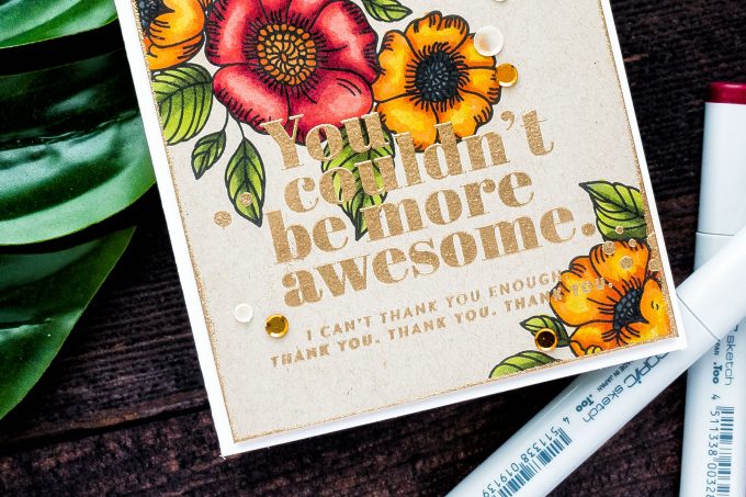
With the coloring done I heat embossed a sentiment. It reads: “You couldn’t be more awesome. I can’t thank you enough. Thank You, Thank You, Thank you“. It was embossed in Antique Gold embossing powder.
To spice this background up I decided to trim the panel down to 4 x 5 1/4” and treat the edges with embossing powder to make them look as if they are dipped in gold paint. I used one of Simon’s pre-made card bases for this card, the A2 side folding card and foam mounted the panel over it using fun foam. The panel warped a bit from the heat embossing and the fun foam helped to flatten it.
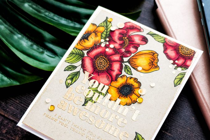
Lastly, I picked a few of the gold and cream sequins from the Sunken Treasure sequins mix to decorate this card. I used my Crystal Katana tool and Simon’s Craft Tacky glue to adhere them in place. I loved using this glue bottle, the applicator is very fine and precise and allowed me to add just the right amount of glue to adhere even the smallest sequins in place.
SUPPLIES
I’m listing the products I used below. Click on the link to go directly to the product. Where available I use compensated affiliate links which means if you make a purchase I receive a small commission at no extra cost to you. Thank you so much for your support!
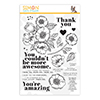 Simon Says Clear Stamps Thankful Flowers Shop at: SSS |
 Simon Says Stamp Thankful Flowers Wafer Dies Shop at: SSS |
 Simon Says Stamps and Dies Thankful Flowers Shop at: SSS |
 Simon Says Stamp Card Kit of the Month October 2019 Shop at: SSS |
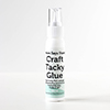 Simon Says Stamp Craft Tacky Glue Shop at: SSS |
 Judikins Eclipse Art Masking Tape Shop at: SSS |
 Neenah Classic Crest 80 Lb Desert Storm Shop at: SSS |
 Simon Says Stamp Antique Gold Embossing Powder Shop at: SSS |
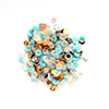 Simon Says Stamp Sequins Sunken Treasure Shop at: SSS |
 Simon Says Stamp Embossing Ink Pad Shop at: SSS |
 Hero Arts Heat Embossing Gun Shop at: SSS |
 Simon Says Stamp Intense Black Ink Shop at: SSS |
 EK Success Powder Tool Applicator Shop at: SSS |
 Mini Misti Stamping Tool Shop at: SSS |
 White Fun Foam 12 Pack 9 x 12 Shop at: SSS |
 Scor-tape 2 1/2 Inch Crafting Tape Shop at: SSS |
 Crystal Ninja Crystal Katana Pick Up Tool Shop at: SSS |


This is SO BEAUTIFUL, Yana!!! I too like to color on colored paper with Alcohol Markers! NICELY DONE!!! ;)<3
This is so beautiful. You can be sure I will be doing this.
I don’t use alcohol markers — at least not yet — but I do find the same thing using pencils on kraft. At first I thought I was doing something wrong that the colors weren’t as vibrant as on white, but recently I realized that it’s the way it turns out on kraft color. Very different look. Thanks, Yana.
Wow! Gorgeous coloring!! The flowers are so beautiful! <3
Your card is gorgeous, love the colors.
Gorgeous!!!!
I enjoy seeing the cards you’ve created on different colored backgrounds. I also appreciate your clear written descriptions of your process.