This post is also available in English
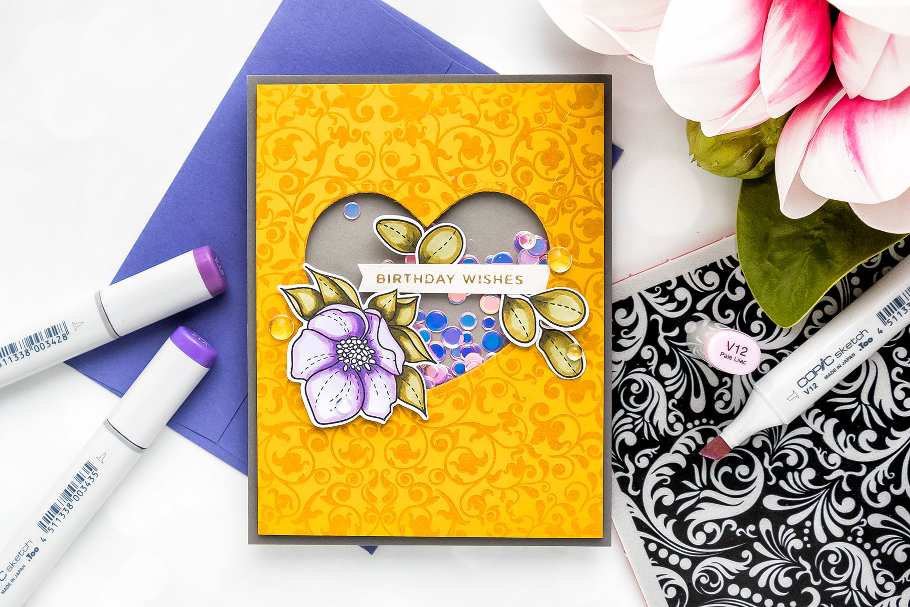
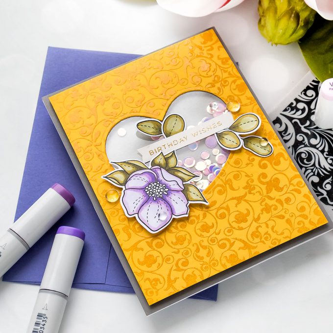
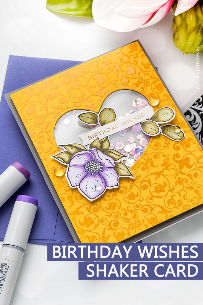
How do you feel about mustard, olive and lavender? I’m talking about colors of course, colors on a card more specifically. This is not a color combo I can ever remember myself using, but I gave it a try the other day. The result? I don’t know, I have mixed feelings about it, but would love to hear your feedback. Is this the kind of color combo you’d enjoy?
Like this project? Pin it and save for later | Curious about my project photography? Click for details.
CARD DETAILS
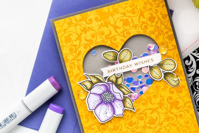
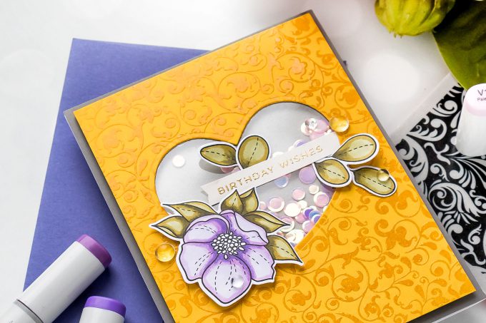
This card was fairly easy to make. I went for a tone on tone background using one of the new background stamps from Simon Says Stamp – Flourish. I heat embossed it in clear embossing powder on mustard yellow cardstock.
Because it’s been awhile since I last made a shaker card I decided I need to make one today. I used coordinating heart die from the Ornate Love set and die-cut a heart shaped opening in the center. Next, I took all the usual steps to make a shaker – added acetate, created “shaker walls” using foam adhesive and filled the well with pretty sequins from the Girl’s Best Friend set.
I closed the shaker using medium gray cardstock, Smoke, and adhered the entire panel onto an A2 white side folding case base made using dark grey cardstock, Slate.
This card needed some flowers so I stamped, colored and cut out one (and a few leaves) using stamps from the Even More Spring Flowers set. I used Olive Greens to color the leaves – YG99, YG95 and YG93 and purples to color the flower – BV11, BV00 and BV000 (it’s a new to me combination).
After everything was cut out with the help of coordinating dies I gold heat embossed “Birthday Wishes” from the Simple Sentiments 2 stamp set, trimmed into a skinny strip and foam mounted on my card. Lastly, I added several clear drops from Pretty Pink Posh.
SUPPLIES
I’m listing the products I used below. Click on the link to go directly to the product. Where available I use compensated affiliate links which means if you make a purchase I receive a small commission at no extra cost to you. Thank you so much for your support!
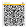 Simon Says Stamp Flourish Background Shop at: SSS |
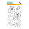 Simon Says Stamp Even More Spring Flowers Shop at: SSS |
 Simon Says Stamp Even More Spring Flowers Dies Shop at: SSS |
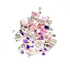 Simon Says Stamp Sequins Girl’s Best Friend Shop at: SSS |
 Simon Says Stamp Ornate Love Wafer Dies Shop at: SSS |
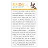 Simon Says Clear Stamps Simple Sentiments 2 Shop at: SSS |
 Simon Says Stamp Smoke Cardstock Shop at: SSS |
 Simon Says Stamp Slate Gray Cardstock Shop at: SSS |
 Simon Says Stamp Card Stock 100# 3 Shades of Gray Shop at: SSS |
 Neenah 110 Lb Solar White Cardstock Shop at: SSS |
 Hero Arts Heat Embossing Gun Shop at: SSS |
 Hero Arts Clear Embossing Powder Shop at: SSS |
 Hero Arts Gold Embossing Powder PW100 Shop at: SSS |
 Hero Arts Acetate Cards 5 X 6 Inches Shop at: SSS |
 Scor-Pal Mini Scor-Buddy Scoring Board Shop at: SSS |
 Simon Says Stamp Small Teflon Bone Folder Tool Shop at: SSS |
 EK Success Powder Tool Applicator Shop at: SSS |
 Mini Misti Stamping Tool Shop at: SSS |
 Simon Says Stamp Big Momma Foam Tape Roll Shop at: SSS |
 Copic Sketch Marker Bv000 Iridescent Mauve Shop at: SSS |
 Copic Sketch Marker BV00 Mauve Shadow Shop at: SSS |
 Copic Sketch Marker BV11 Soft Violet Shop at: SSS |
 Copic Sketch Marker YG93 Grayish Yellow Shop at: SSS |
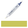 Copic Sketch Marker YG95 Pale Olive Shop at: SSS |
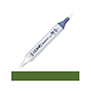 Copic Sketch Marker YG99 Marine Green Shop at: SSS |
 Tonic Studios 8.5 Inch Paper Trimmer Shop at: SSS |
 White Foam Squares Shop at: SSS |
 Pretty Pink Posh 4MM Clear Droplets (small) Shop at: SSS |
 Pretty Pink Posh 6MM Clear Droplets (medium) Shop at: SSS |
 Tonic Deluxe Adhesive Nuvo Glue Shop at: SSS |
 Crystal Ninja Crystal Katana Pick Up Tool Shop at: SSS |
 Scor-Tape 1/8 Inch Crafting Tape Shop at: SSS |
 Spellbinders Deep Sea Die Cutting and Embossing Machine Shop at: SSS |
SAVE ME/PIN ME TO PINTEREST
Like this card idea? Be sure to save it to one of your Pinterest boards for future reference!


I love the card Yana, but if I am honest, it’s not one of my favourite colour schemes. I think I would prefer lemony shades of yellow with that lovely purple. It’s all a question of personal taste though isn’t it? “One man’s meat is another man’s gravy” as the saying goes! The composition of the card is super and if someone cared enough to send it to me I’d be really pleased, and I certainly wouldn’t be criticising the colours!
Well Yana, I have to say, this is not a colour combo I have ever tried either (nor would I have thought to….) however, I love it. The lavender and olive are subtle enough to look amazing with the mustard. I love the tone on tone of the mustard colour. Overall, I think it turned out beautiful and yet again, you have inspired me to just “try” something new and different! It might just work as yours has! Well done!
That’s a different color combination! Lovely card!
I love the contrast of colors of mustard & lavender with the green. After all, if we look at nature, you’ll see those colors together in flowers. The mustard and lavender are one of the school colors here in NE Ohio, so it must be great.
To be honest, I would never consider this color combination in these saturations. I would probably tone down the mustard to a more paler yellow. Yellow and purple can work together if you modify the color values. I was a color consultant for a major paint co., and the intensity of the mustard and deep lavender is not pleasing to the eye. Your card layout is great!
Hi Yana! I love the color combo you used! I wouldn’t have thought of it either but I think it worked nicely. I found the layout of the card to be very beautiful! Keep up the great work!
I love the color combination and it is pleasing to my eye, so…ignore all the negative comments and keep up with the great work!!! Thank you for another fantastic job.
Beautiful colors. I would totally use these colors. I always love your color combos, you have a good eye for colors and designs. . I love the awesome stamps.
I really like this color combination! It isn’t traditional, but it is very eye-catching. Lovely card…thanks for sharing.
It’s different; but I like it. The one thing that throws me off a bit is the olive leaves.
That yellow is so rich and warm, love it!! And I think the combination with the purple is a good one. It is on the oposite of the color wheel so it really stands out. A royal blue would be a nice combination too I think. I always love to see different color choices and even more when they are not obvious. I think one of the greatest things about creating is trying out new ideas and that is what I love most in this card!