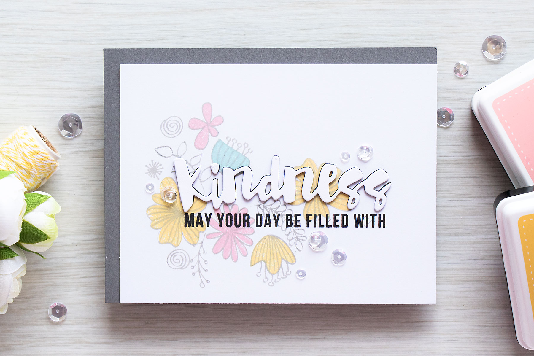
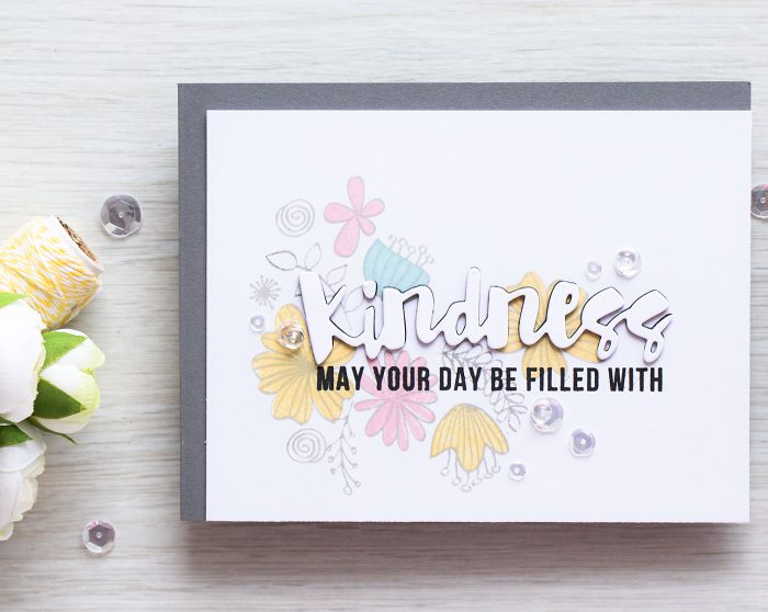
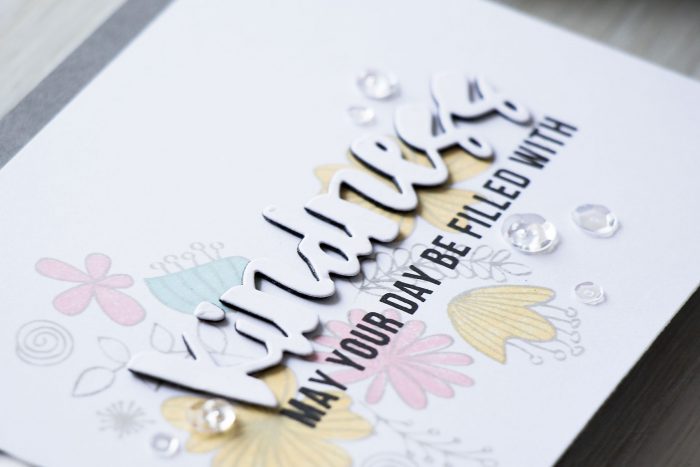
While bold and vibrant colors (and cards) are my absolute favorites, I do occasionally enjoy creating less bright projects. I wanted the die cut word Kindness be the star of the show on this card, so I decided to go with softer colors.
Like this project? Pin it and save for later!
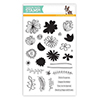
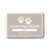
To create this card I first die cut Kindness out of white cardstock (set the die cut aside) and used the negative to sketch it on my white panel, this helped me visualize my card and decide where I needed to stamp the flowers. I used Stone ink color for stamping flower outlines and only did a cluster on the left hand side spanning a bit to the right.
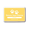
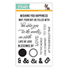
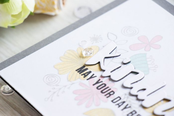
I “colored” flowers using matching layer stamps using Duckling, Twirling Tutu and Surf Blue. I think this is a beautiful color combination, perfect for Spring. To held the white Kindness die cut stand out a little better I die cut an identical word out of adhesive foam sheet in black, adhered white die cut on top and adhered that onto the stamped panel. The offsetting of the white die cut wasn’t intentional, and I didn’t like the way it turned out at first, but after I stamped “may your day be filled with” from the Big Add Ons set in black ink I really liked the final result.
I adhered my stamped panel onto a gray card base and added several clear sequins with a small clear drop adhered inside several of the largest sequins.
SUPPLIES
I’m listing the products I used below. Click on the link to go directly to the product. Where available I use compensated affiliate links which means if you make a purchase I receive a small commission at no extra cost to you. Thank you so much for your support!
 SSS |
 SSS |
 SSS |
 SSS |
 SSS |
 SSS |
 SSS |
 SSS |
 SSS |
 SSS |
 SSS |
 SSS |
 SSS |
 SSS |
 SSS |

Nice card Yana and different of what we are used to see with you ! Thanks for sharing.
Hi Yana, very pretty! I love the soft background and the dual colored offset sentiment. Thanks for sharing and always inspiring.
Very stylish card! Love the soft colors of your florals and black foam for kindness word looks awesome!
Love these soft colors on your beautiful card!
This is so beautiful Yana. The pastel shades are just gorgeous!
A beautiful card as always, Yana.
The black offset of the word really makes your card pop Yana – funny how a mistake sometimes works out so well.